A major design refresh could soon be making its way to Google Messages, potentially changing how millions of Android users interact with one of the most essential communication apps on their phones. According to reports from Android Authority, Google is preparing to introduce a context-based menu system that adapts its options depending on what type of message you’re interacting with — a big step forward for both accessibility and user comfort.
For years, Google Messages users have dealt with one frustrating issue: the app’s upper-right hamburger menu. On larger screens, reaching that menu with one hand has often felt like an Olympic event, forcing users into awkward stretches just to perform simple actions like deleting or forwarding a text. The situation became even more uncomfortable as Android smartphones grew in size — a trend that began with the Galaxy Note era and never looked back.
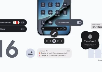
The redesigned UI aims to fix this. Instead of hiding critical functions behind a distant top-bar menu, Google is testing a context-aware options panel that appears directly below the selected message. Users will simply long-press a message to reveal the available actions — such as Reply, Forward, Copy, Star, Delete, Info, or Select more. When long-pressing an image, a Save option will appear; if it’s a freshly sent text, an Edit button will show up. These menus won’t be static either — they’ll intelligently change based on the content of each conversation.
This shift is more than a visual tweak; it’s a major usability upgrade. By placing options within immediate thumb reach, Google is acknowledging the challenges of one-handed operation on today’s larger phones. It’s a small but meaningful change that could make the overall chat experience faster, more natural, and far less clumsy.
In addition to the new dynamic menu, the selection experience is also being refined. When users select multiple messages, small check marks will now appear next to each chosen chat, providing a clearer and more intuitive visual cue. Selecting or deselecting messages will be as easy as tapping on the circular icons beside them — again emphasizing ease of use and ergonomic design.
While the update hasn’t officially rolled out yet, signs of this new layout were spotted in the Google Messages v20251020 beta, suggesting that the public release may not be too far off. Google’s UI philosophy has always revolved around simplicity and practicality, and this latest improvement shows how even small interface changes can have a huge impact on daily usability.
For Android users who rely on Messages for everything from texting to media sharing, this could be one of the most noticeable upgrades in recent years — a blend of smart functionality and thoughtful design that finally gives your thumbs a break.


