Google continues its push to modernize its Android apps with Material 3 Expressive design updates, and the latest app to receive this treatment is Google Contacts. While the Contacts app isn’t among the most frequently used Google applications, its refreshed look brings a cleaner, more user-friendly interface.
The updated design (version 4.6.1.x) is now rolling out through the Google Play Store. One of the most noticeable changes is the shorter bottom navigation bar, which still retains the three main tabs: Contacts, Highlights, and Organize. Each contact name now appears inside a rounded container, making individual entries easier to distinguish compared to the previous flat list design.
Individual contact pages also get a redesigned contact card featuring a large avatar with the contact’s name displayed prominently beneath it. Just below, users will see four key actions — Call, Message, Video, and Email — which now appear in pill-shaped buttons instead of simple circles, improving clarity and accessibility.
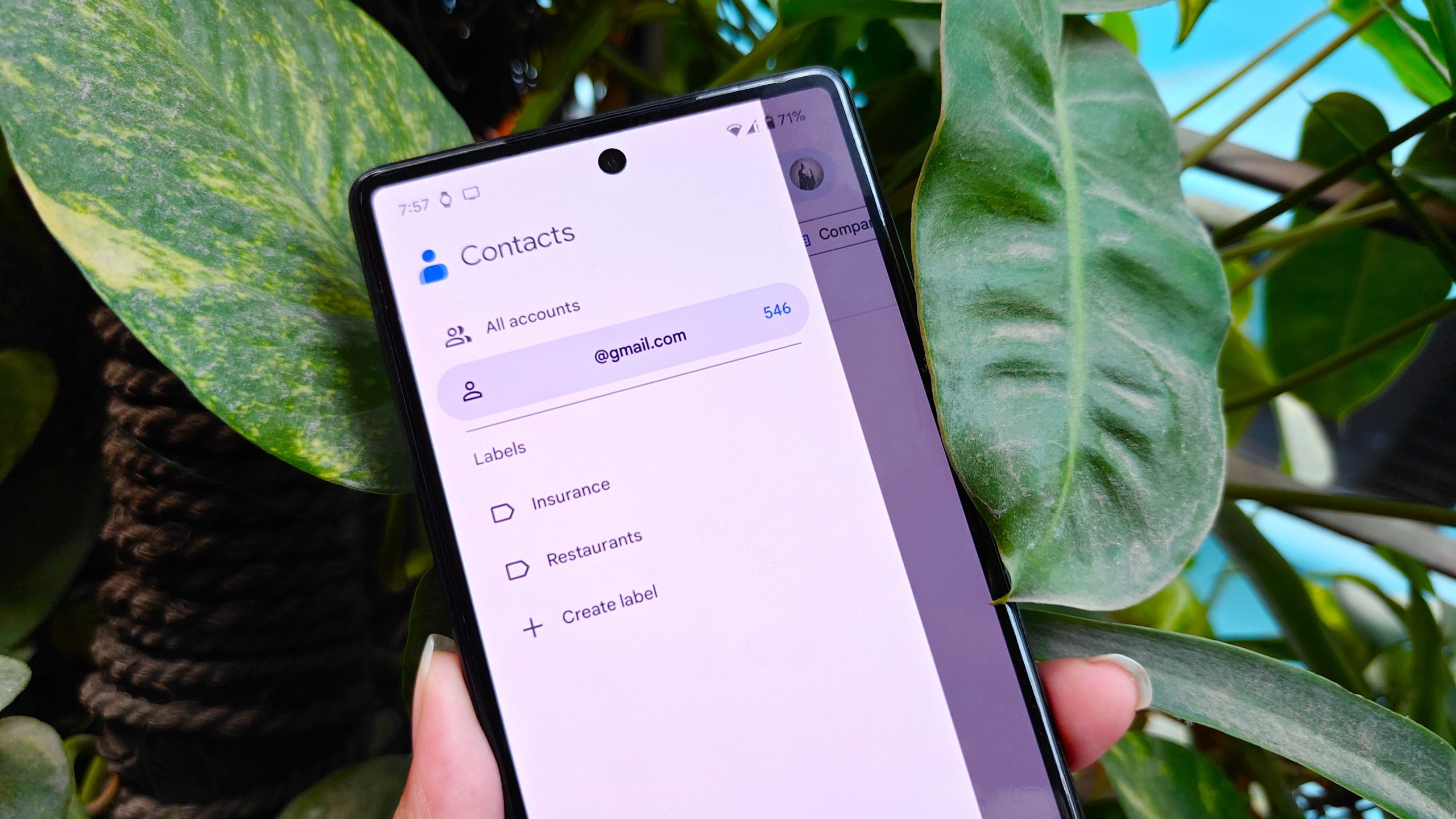
While these may seem like subtle tweaks, they align the app with Google’s broader Material 3 vision, which includes Dynamic Color integration. This feature adapts the app’s appearance to match the primary colors of the user’s phone wallpaper, giving the app a more personalized and visually appealing look.
For users wondering whether they have the latest version, head to Settings > Apps > See all apps > Contacts > App info and scroll to the bottom to check the installed version.
Though Google Contacts might not be the most frequently used app on Android devices, this update demonstrates Google’s commitment to maintaining consistency across its ecosystem. The refreshed interface makes the app more intuitive, visually distinct, and easier to navigate — subtle improvements that enhance day-to-day usability.


